This is the third article in a series. If you’re not yet convinced that It’s not only who you know, it’s who they know, you may want to check out that article first. Also, I try to avoid using technical terms in these articles. At the end of this one I provide a list of commonly used technical words.
Now that you know how important “who they know” is to your life, don’t you want to see what shape your community makes? Mapping the people we spend time with can help answer questions we have about our experience as social animals and surface hidden patterns that may not be obvious such as:
- From whom am I most likely to get new information, opportunities, and ideas?
- Which group(s) of people influence my habits and behaviours?
- How resilient is my support network of advice and practical help?
Instead of making maps of our neighbourhood with buildings and roads, we’ll make maps of our community with people and connections. That way we can better understand who we know and who they know.
This 3-step guide will help us make a map of our own. Making a map doesn’t need to take a lot of time and doesn’t require any fancy tools. We can make one with paper and a pen, or use whatever software tool we usually use to make presentations or diagrams. This map took me 30 minutes to make using Keynote. The names have been changed to protect their privacy.
These types of maps only have two parts:
- People: circles that represent each of the people in the map
- Connections: lines that show who in the map is connected to whom and gives the map it’s shape
Maps are only useful if they can help us explore something we’re curious about or answer a question we’ve asked. A map of New York can’t help us if we’re lost in London, regardless of how detailed it is. One map might help us get from one museum to another, but it won’t tell us what exhibits we can see on each floor in one of those museums.
For our map, we’ll use this guiding question:
If I am the sum of the people I spend time with, who am I the sum of?
It’s important to remember that there’s no such thing as a perfect map, just like there’s no such thing as a perfect community. We are always balancing tradeoffs between size, interconnectedness, and diversity. We’ll discuss more about this when I explain how to read the map in the next article.
Step 1: choosing people to include in the map
When someone makes a map, they make a decision about what to include and what to leave out. If they are making a map of a country, they might choose to include cities based on a minimum size. If they are making a map explaining how to get to their favourite neighbourhood restaurant, they might include only a handful of landmarks along the way.
It’s not realistic to make a complete map of all the people we have ever known and all their connections. Focusing on only who we’ve spoken with in the last two weeks helps us simplify the map. It’s not a judgement about who is important and who is not, it’s just a snapshot of a moment in time. We can also change, shorten, or lengthen the time window to add or remove people from the map. If the last two weeks weren’t very typical (e.g. a holiday), we can choose another two week time window in the recent past. Our life stage and profession are among many attributes that can have a huge impact on the number of people we speak with in a given day.
In the last 2 weeks:
- Who did I speak with in person?
- Who did I speak with on video chat?
- Who did I speak with on the phone?
- Who did I exchange text messages with?
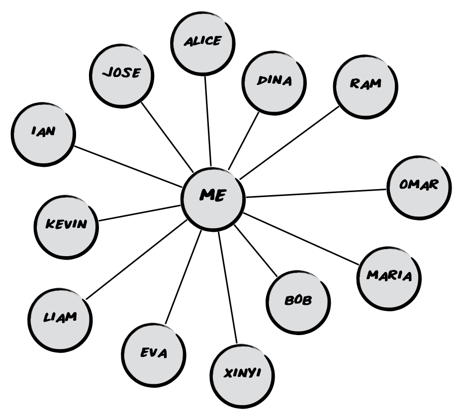 As we go through each question and reflect on the two weeks, we’ll come up with a list of names. We’ll add each of their first names or initials into circles on the map, all connected to us at the centre.
This is not a memory test. We can look at our phone or calendar to help us remember. However, there are some people that might not be obvious, like our favourite barista, one of our friend’s children, or a person we engage with on social media but haven’t met in person. Think carefully about who might be missing.
It doesn’t matter how many people the map has, though I’d recommend a minimum of 5 and a maximum of 50 based on Robin Dunbar’s work on social groups.
Step 2: connecting people that know each other in the map
If we were taking a road trip, we’d be interested in a map that includes highways we plan to take. If we were exploring a city for the first time, a map of the public transit system might be helpful. If we were taking a walking tour, a map of the sidewalks and footpaths might be enough. In each of these situations, we are using different types of connections between locations on a map.
After we figure out which people to include in the map, we can consider how they are connected to each other. They might be family members, classmates, or colleagues. For our purposes, these distinctions aren’t very important. We’re just interested in whether the people in the map know each other.
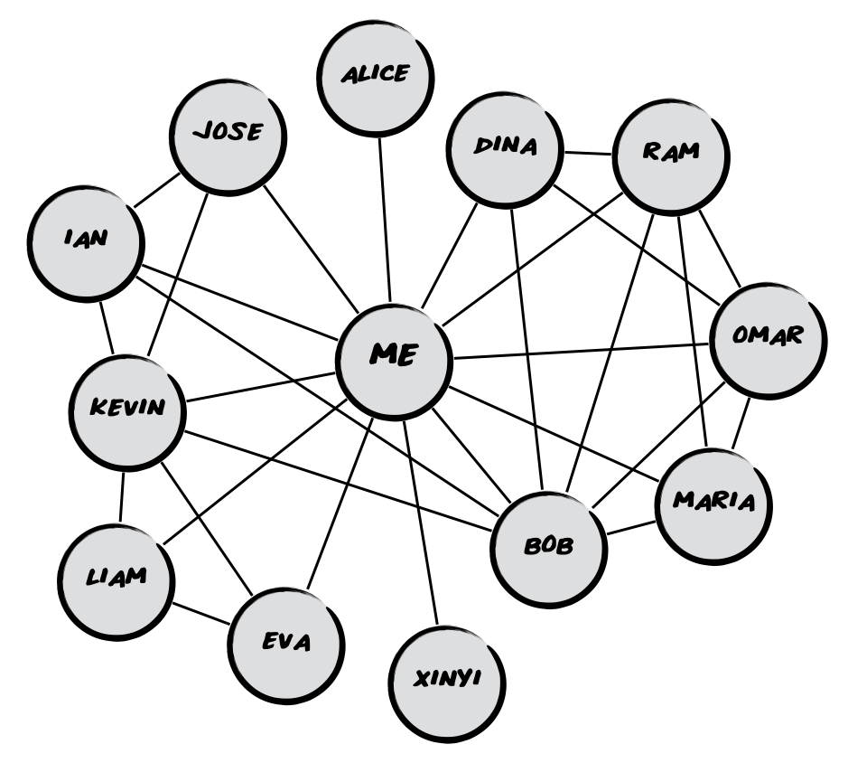 For every possible pair of people in the map, ask yourself, “Do these two people know each other?”
If we want to make the question a little more selective, we could ask ourselves, “Would these two people spend time together without me?” This helps if two sides of the family met at a wedding several years ago, but haven’t spoken to each other since.
For each pair of people that know each other, we should draw a line between the circles in the map. We’ve already made a social map!
Step 3: understanding what attributes they share
When I visited Penang, I was delighted by the local tourist map. Instead of showing where all the restaurants were, the map had pictures of each of the famous Penang dishes and where to eat them. They focused on the attribute of each place that was most important, the famous dish they serve.
Attributes are ways to categorise people based on how they are similar. We can use almost anything: gender, industry, or favourite dessert. Which attribute we choose to highlight depends on what we’re trying to learn. Are we interested in the diversity of the people we spend time with? Or, are we interested in their habits? We can write a question for the attribute(s) we’d like to include. We don’t have to write it as multiple-choice question, but it’s often helpful to think of it in that way. We should be able to answer the question for most of the people included in the map.
Here are some example attribute questions that we can use:
- Which option best describes this person’s gender? a) same as mine, b) different than mine, c) don’t know
- How old is this person? a) more than 10 years younger, b) within 10 years of my age, c) more than 10 years older, d) don’t know
- What continent does this person live on? a) Africa, b) Asia, c) Australia, d) Europe, e) North America, f) South America, g) don’t know
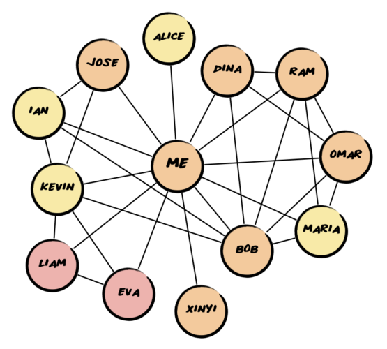
 We can make the circles different colours based on their attribute. Choose an attribute you’d like to map. On the left, I’ve mapped attribute question 2 focused on age. The yellow circles represent people that are 10+ years younger than me. Orange represents people my age. Pink circles represent people that are at least 10 years older than me.
That’s all there is to it. If we’re curious about how representative the map is, we can choose another two-week window and make another map for comparison. We can also make a new map with different guiding questions, such as:
- Who supports my freelance business through advice, collaboration, and referrals?
- How diverse is the information I get from my network (e.g. news, opinions, ideas, books, events, products, services, even gossip)?
In the next article, we’ll learn how to read our map.
A note on language
In my experience, the language used to describe this type of visualisation varies by discipline. Data scientists, physicists, and sociologists don’t use the same terminology and the words are often opaque. My hope is to make this type of exercise accessible to a wider audience.
- Map – most of the time this is called a graph, but if they are displaying the network around one individual they can sometimes be referred to as a sociogram or egonet
- People/Circle – most commonly referred to as a node or vertex and can represent people, organisations, or even pieces of information
- Connection/Line – can be called an edge or tie and represents a relationship between two nodes
- Shape – often described as the structure of the graph with reference to it’s density and how the nodes are clustered