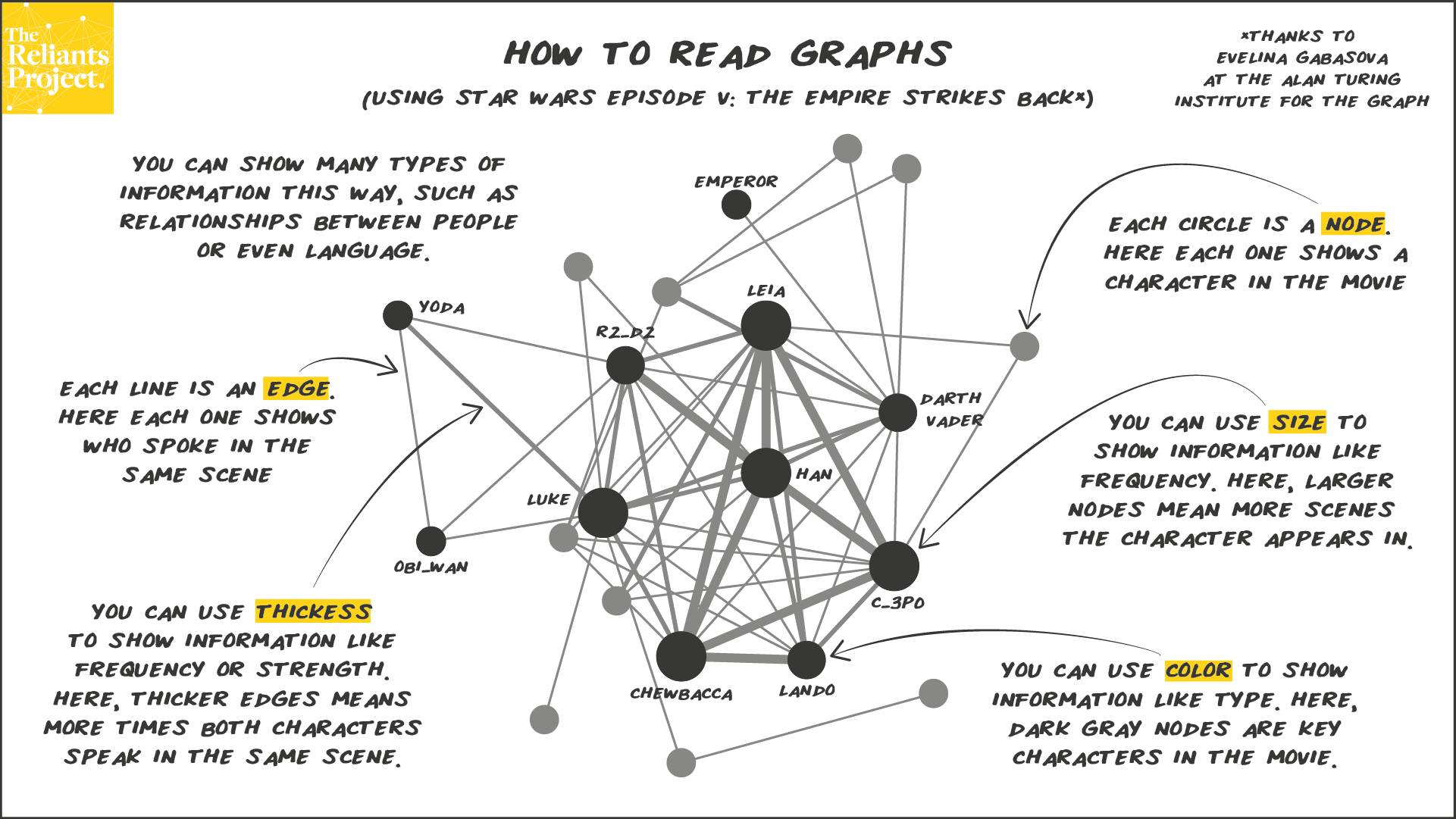
The Star Wars movies have been subject to an incredible amount of analysis, including a fair amount of network analysis. Here’s what we can learn from reading this graph:
- There are 21 characters in The Empire Strikes Back, 11 of which are key characters
- There are 5 characters that show up in the most scenes (C-3P0, Chewbacca, Han, Leia and Luke) and
- There are a handful of key characters that show up in only a few scenes (Emperor, Obi-wan, and Yoda)
- The Emperor and Yoda never speak in the same scene, but C-3P0, Chewbacca, Han, and Leia frequently do
While this might not feel meaningful in isolation, comparing this to other movies in the franchise may uncover patterns and insights. One insight might be how the importance of a character changes over time. Here I’m using it to explain the basics of how to read graphs using a subject that most people are familiar with.
How did I come to these conclusions? There are two basic components of a graph:
- Edges: which show the relationships (e.g. speaking in the same scene, working in the same organisation, showing up in the same sentence)
- Nodes: which show the objects you are interested in understanding the relationships between (e.g. characters in a movie, people in an organisation, words in a book)
For edges, there are three main ways you can display them to show additional information:
- Color: which can show relationship type (e.g. friends vs. enemies)
- Thickness: which can show relationship strength or frequency (e.g. frequency of speaking in the same scene, relationship strength between team members vs. other departments, how often two words show up in the same sentence)
- Direction: adding an arrow to one or both ends of the line to show the direction of the relationship (e.g. one character speaks to another but there’s no reply vs. dialogue between characters)
For nodes, there are two main ways that you can display them to show additional information:
- Color: which can show object type (e.g. key characters vs. others, which department a team member belongs to, parts of speech)
- Size: which can show frequency (e.g. number of scenes the character shows up in, number of years at the organisation, number of letters in the word)
As you can see, this way of showing information is incredibly flexible. There is a deeper analysis that we can do, but we’ll save that for a future concept. Interested in more graphs like this? Evelina Gabasova actually created them for all six movies.
Ready for the next concept? The next one in the series is Concept 3: Using Krackhardt’s Kite to Explain Centrality.